Pocket: A Clean, Confident Display Font for Digital Brands
I was halfway through refining the hero section of a boutique online store’s new homepage—soft product photography, minimalist navigation, warm neutral palette—when the headline just didn’t land. The current sans serif felt safe, but forgettable. So I swapped it out for Pocket, and everything clicked.
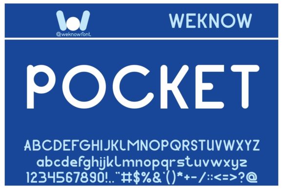
Pocket is a modern display font with quiet confidence: clean geometry, subtle warmth in its curves, and just enough character to feel intentional—not flashy, not sterile. It’s not a script or a serif, and it’s not trying to be playful or futuristic. Instead, Pocket lands in that sweet spot where clarity meets personality—ideal for digital spaces where first impressions happen in under two seconds.
In that hero section, Pocket sat perfectly over a softly blurred lifestyle image. No heavy contrast needed—the font’s generous x-height and open counters kept it legible even at 48px on desktop and scaled cleanly down to 36px on mobile. I tested it across devices: crisp on Retina screens, still readable on mid-tier Androids, and stable in Safari’s sometimes finicky font rendering. No wobble, no thinning—just consistent presence.
What makes Pocket especially useful for web designers is how it behaves in real layout contexts. On a coaching website’s landing page, I used it for the main value proposition (“Clarity Starts Here”) and paired it with a neutral, highly legible sans serif (like Inter or Manrope) for body copy. The contrast worked instantly: Pocket anchored the message; the supporting font carried the nuance. No visual competition—just clear hierarchy.
For a creative portfolio site, I applied Pocket to project titles and category headers—never body text, never captions. That’s where its strength lives: short, high-impact phrases. It shines in logos and logotypes too—its balanced letterforms hold up beautifully at small sizes on favicons or app icons, and scale elegantly across social banners and email headers.
Readability on mobile? Solid—if you keep line length tight and avoid cramming more than five words into a single line. I tested Pocket in a sticky header on a course sales page: 24px weight, letter-spacing of 0.5px, and it remained scannable while scrolling. On dark backgrounds, it gains extra gravitas—especially with a subtle text shadow or light background overlay. Over imagery, I often add a soft semi-transparent bar behind the text, then let Pocket sit confidently on top.
It’s not a workhorse font. You won’t want Pocket for paragraphs, pricing tables, or form labels. But as a display font, it earns its place in your design system by doing one thing exceptionally well: giving digital content a grounded, human-centered voice. Think of it like a well-cut blazer—it doesn’t shout, but it signals care, consistency, and intention.
Pairing Pocket thoughtfully matters. With a clean, low-contrast sans serif, it feels contemporary and accessible. With a warm, slightly organic serif (like Literata or Cormorant Garamond), it leans into editorial sophistication—great for blog headers or digital magazine layouts. Avoid pairing it with other display fonts or decorative scripts; Pocket’s charm is its restraint.
I also checked what’s included before deploying: Pocket ships with standard weights (Light, Regular, Medium, Bold), true italics (not slanted), and full Latin character support—including diacritics for Spanish, French, and German. No surprises there. For multilingual projects, verify extended language coverage—but for most English-first digital brands, it’s ready out of the box.
Webfont delivery was straightforward. I loaded it via a self-hosted WOFF2 file (smaller filesize, faster load) and set up a fallback stack that gracefully degrades to system sans serifs. No FOIT or FOUT drama—just smooth, fast rendering. And yes, it’s a commercial font, so I double-checked the license covers web use, client projects, and SaaS applications. All clear.
Where else did Pocket earn its keep? On a campaign landing page for a sustainable apparel brand, I used it for the headline (“Wear What Lasts”) and subhead (“Designed for movement. Built for years.”). The font’s gentle rhythm echoed the brand’s calm, enduring ethos—no forced energy, no artificial urgency. In a digital brand kit I delivered to a freelance illustrator, Pocket became the go-to for social post titles and workshop banners—consistent, scalable, and unmistakably theirs.
It’s also surprisingly effective in unexpected places: a subtle “New” badge beside a product card, a bold section divider like “How It Works”, or even a short CTA button (“Start Free Trial”) when styled with tight tracking and ample padding. Just don’t stretch it—Pocket isn’t meant for all-caps wall-of-text treatment or ultra-narrow widths. Let it breathe.
One thing I appreciated during testing: Pocket doesn’t demand attention—it invites it. That’s rare in today’s landscape of aggressive type choices. It supports the content instead of competing with it. On a blog redesign, I used it only for the site name in the header and post titles—everything else stayed in a highly readable body font. Readers told me the site felt “easier to move through,” which, in UX terms, is about as high a compliment as you’ll get.
For UI designers building dashboards or admin interfaces, Pocket isn’t the answer—but for any public-facing digital experience where brand voice matters—landing pages, portfolio sites, course sales, creative studios, indie publishers, or small business websites—it’s a thoughtful, reliable choice. It’s not trendy, and that’s why it lasts.
If you’re evaluating display fonts for your next project, ask yourself: Does it support the message—or distract from it? Does it feel like part of the brand, or just decoration? Does it work quietly across devices, contexts, and backgrounds? Pocket answers yes—to all three.
And sometimes, that’s exactly what a headline needs: space to speak, clarity to land, and enough character to be remembered—not because it shouts, but because it shows up, consistently, with care.